Safari, IE, Firefox
You hate Safari.
Heeter
Close. You missed one out of three. Safari is actually my favourite browser, followed by Chrome. WebKit is an awesome rendering engine, AND so far has given me the least trouble developing this website. Based on rendering engines, you win a prize
")
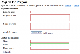
The only difference between Safari and Chrome is that Safari uses "no file selected" and Chrome uses "No file chosen".
Chrome, IE, Firefox is the order.
IE8, Opera and Safari
X-Istence don't use no Firefox!
Umm, Safari?
Nope, entirely wrong. And while I generally don't use Firefox, unfortunately it is required when designing and building a website. Firefox is bloated and slow compared to Chrome and Safari on Windows and Mac OS X respectively.
ie6 ie7 ie8
Yeah, this page does not render correctly in IE 6
Completely wrong.
---
IE is actually the browser giving me the most trouble, it does some weird funky stuff to the fonts while attempting to ClearType or font smooth them. Neither FireFox nor Chrome exhibit the same behavior, it causes certain font choices to look bad in IE. I show case the website in Chrome or FireFox and the fonts look just fine and my boss likes it, show it in IE and the fonts just look fuzzy, not sharp, unpleasing and he does not like it. I don't know how to fix it, turning off font smoothing/clear type does absolutely nothing. This issue also comes up when using bold on the font, in Chrome and Firefox it looks good, and the font is readable without a headache, in IE it is fuzzy and causes headaches when look at for too long. Not sure why that is.
Not only that, but if IE 7 is not in strict mode, certain properties just don't work, for example on an image you can give it margin's and padding. Generally used to move the image around, or if it is wrapping text to cause it to have some space around it rather than having the image sit right up against the text. So you put it into strict mode with a XHTML doctype, and suddenly padding and all that jazz works, BUT it changes the way it renders lists, which I am using to create the menu that is located in the header of that page (not in screenshot), so while in Chrome and Firefox there is a gap in between the header items, there is none in IE. So I had to widen the gap for all browsers, just so that IE has a small gap.
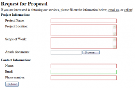
That is not to say that the other browsers are not without flaws, Chrome renders text-area boxes wrong. It gives them a bigger width than what I have specified. (Chrome is Sample 1). That may have to do with the ability to resize the text area box using the little grip handle. It makes the form look out of place though, as if I had not cared to make it the same size. I will probably end up submitting a bug report for it. It is an issue with WebKit, hopefully one that will get fixed :-D.
The other issue I have ran into is that all of the browsers use different handling schemes for when an image is missing. Opera, Chrome, Safari all interpolate the value of a missing image based on other knowledge about the page. For example, if you have the same piece of code written on a page, with just different text, but same layout (divs and all) it will make the missing images have the exact same size as the images that do exist, thereby not screwing up the entire formatting of the page. This way if you have 4 div's with images floating in them, two of the images exist and they both are 150 x 150, for the other 2 div's that are supposed to have floating images but don't because they don't exist they will just put placeholders of size 150 x 150 in, EVEN if the width/height is not set in the HTML or CSS. Firefox will just put the Alt text into the document, thereby causing layout issues, and IE will make the picture 100% of whatever container it is in (in my case a div). Will write a test case for this sometime later today to showcase this behaviour.
Sure, missing images is bad, but I believe that the behaviour that WebKit, and Opera exhibit is the right one, this may take more time/code to get to that point but the effect is more pleasing.
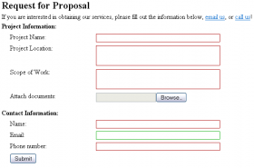
The last bit that is annoying is that IE and every other browser entirely disagrees on the box model and how the various parts should be applied, I have the case right now where IE puts a certain element 1 pixel higher than every other browser, which means that instead of having it be flush to the bottom of a div, there is a 1 pixel gap. Now, I have fixed this in such a way that in IE while the element is sitting higher you you won't notice it, but it is rendered correctly in all the other browsers. I can sit and bang my head against the desk all day, but it won't help fix those issues with IE. It is highly annoying stuff like that happens since it means more work for me. (See attached images, I know they are not that great, but mspaint sucks, see how the ie7 one the element is sitting higher than in the webkit screenshot?)


