My feedback, tho I am sure some of you know I already rolled out a few things
")
Kinda like the new buttons, vista one is a good idea but not sure where it will link. I collapse my headline box (something you have omitted
) so I would really like a forum button up there as I dfind myself looking where to click when its collapsed - often resort to the link on the left.
A few days hopefully we will be a Windows Vista featured community so that graphic should be updated, lets hope it fits in!
not sure where to put the RSS/Live buttons, did have them on every single post but it was fairly redudant, it was there to represent all categories but one for all will generally suit. Just need to find a good spot for it.
Headers might be too clear, but I like the idea of changing them, might be able to make them more css friendly too.
Will have to see how things work out on the last one, sure we can come up with something cool.
- Left space with quotes, would love to have the text wrap around that but I found that if you insert an image it all goes to hell, perhaps there is a cooler way to integrate them, I think the offset quoting method really works for us.
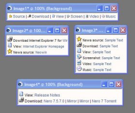
Basic news images? I do try to standardise them - ie 100x100 no transparency on the outer edges, up to the news posters to try and stick to them - I have found myself replacing eisting images but not so ofte. I don't think breaking down the icons intocategories is the way to go.
Recent articles is staying, I keep starting articles but never have the time to finish them, kinda sucks, really wanted to write an wmp11 one, got all the data together but just can't sit down and write.
Stats I like tho were affected recently by a change made to the forums. Affiliates is part of a deal really, or at least some, I might be able to remove a few of them to a special links section called affilates, but I tend to operate on an hour system where if the affilite shows our link on every page of their site, I do the same, again link buttons have the same deal. I am making it harder and harder to affiliate with us.
Reduced the main font on the frontpage to 12, and the headline one to 13, some others need to be knocked down by one as well really, will do that quite soon.
I have restarted the comment customisations for the actual shownews pages, but currently only on my test theme of the moment - 800. Will be rolled out quite soon.
Last comment by I quite like, I guess it could be made alt text on the comment button itself, would need to see how it looks. Comment button could be moved to the top now I have.will be remoivng the rss/live buttons from that area.
Ad placement I worked quite hard on, a pain when you need to log out to see them
Google was green to moth bring a little colou and make it obvious that it was an add, I have changed some back to blue.
Logo I am gonna be extra fussy about, needs alot of thinking